Maps, tools and infographics
Global population
") The size of it – How the world’s population has changed (The Economist) click here
The size of it – How the world’s population has changed (The Economist) click here
Mapping initiatives
") Green economy policies, practices and initiatives (United Nations) click here
Green economy policies, practices and initiatives (United Nations) click here
") The Global Transition to a new economy: Mapping a green and fair world (nef, SF, GEC) click here
The Global Transition to a new economy: Mapping a green and fair world (nef, SF, GEC) click here
Natural capital and ecosystem services
") Eco4Biz – Ecosystem services and biodiversity tools to support business decision-making (World Business Council on Sustainable Development, April 2013) click here
Eco4Biz – Ecosystem services and biodiversity tools to support business decision-making (World Business Council on Sustainable Development, April 2013) click here
Tools to help businesses measure their environmental impact and value natural capital in their supply chains and operations
 Biodiversity Planning Toolkit (United Kingdom) click here
 Green Infrastructure Valuation Toolkit (United Kingdom) click here
Energy
")
Climate Analysis Indicators Tool: CAIT 2.0 (World Resources Institute, 2013) click here
")
Interactive – global energy sources (Nature) click here
See also: The global energy challenge: Awash with carbon (Nature / November 2012). See debate on calculations of fossil fuel reserves in comments section.
")
World greenhouse gas emissions flow-chart (Ecofys, data for 2010) click here
") How many gigatons of carbon dioxide…? (Information is Beautiful) have we released to date?…more can we safely release?…are left to release? click here
How many gigatons of carbon dioxide…? (Information is Beautiful) have we released to date?…more can we safely release?…are left to release? click here
Information is Beautiful CO2 megasheet (Excel doc with data and sources) click here
")
‘Unburnable carbon‘. Countries most exposed to the carbon bubble – map (Kiln) click here
")
Map of basins with assessed shale oil and gas formations, as of May 2013 (US EIA) click here
Climate change
")
The Carbon Map (Kiln) click here
") The world’s carbon trading schemes mapped (RTCC, January 2013) click here
The world’s carbon trading schemes mapped (RTCC, January 2013) click here
")
Climate disasters displace millions of people worldwide in 2012 – map (iDMC/NRC) click here
")
Infographic: What Climate Change Means for Africa and Asia (World Bank, June 2013) click here
")
Infographic: Climate Change in Asia and the Pacific (Asian Development Bank, April 2013)
United Nations Climate Change Negotiations
") Infographic: The politics of climate change (Al Jazeera) click here
Infographic: The politics of climate change (Al Jazeera) click here
The positions of key countries and political blocs on climate change measures before the COP18 in Qatar.
Endangered Species
") What is missing? (What is missing Foundation) click here
What is missing? (What is missing Foundation) click here
") The world’s extinct and endangered species – interactive map (IUCN / The Guardian. September 2012) click here
The world’s extinct and endangered species – interactive map (IUCN / The Guardian. September 2012) click here
100 most endangered species: priceless or worthless? – in pictures (The Guardian) click here
") The IUCN Red List of Threatened Species click here
The IUCN Red List of Threatened Species click here
Rio+20 Sustainable Development conference
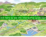
 Rio+20 interactive: is the world getting better or worse? (Kiln, June 2012) click here
Leave a Reply